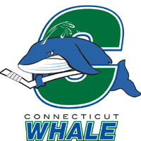
 The terrible new logo for Hartford’s minor league hockey team at least puts to rest those old feelings that got stirred up once Howard Baldwin started talking about bringing back the Whalers to town.
It’s too good to be true. Like vaudeville returning or the Beatles reuniting. Can the late great Hartford Whalers actually be returning? Well, probably not. The NHL doesn’t want to admit it made a mistake, letting the team flee to the South. It’s not like Hartford became a stronger market since it left.
But when they announced they’d be changing the name of the minor league replacement the Hartford Wolf Pack to something called the Whale, well I thought: We’re on our way.
Until I saw that logo.
 Unlike the elegant, classy and timeless Hartford Whalers logo, left, designed by Peter Good, with beautifully constructed H in the negative space between the whale fin and the W of the team, this is all bad minor league cartoon: A too tough whale caught in the curve of a strange green C, like some big bit of ocean waste it’s battling.
It’s like the Wolf Pack logo before it and a dozen other minor league logos, it’s about characters and mascots and acting tougher than you really are.
I’ll save my money for reproductions of the old team and continue to stay away from the minor league play.
Yet the unveiling of the new name and logo brought to mind something too: While the Whalers were about the New England hunters of the sea, the Whale is merely the hunted. Or beached.