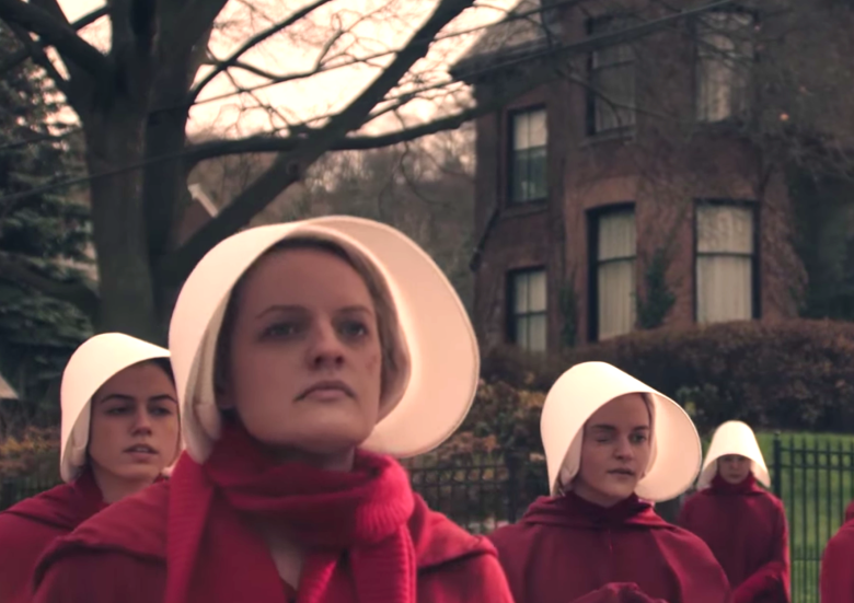
 Primary colors make their point in the beautifully shot “The Handmaid’s Tale” (Hulu, streaming), starting today with a trio of episodes.
Director Reed Morano is a former cinematographer, true (“Vinyl,” “Looking” but also Beyonce’s “Lemonade”). But she told reporters at the TV Critics Association press tour earlier this year that color was important in interpreting Margaret Atwood’s iconic novel.
“It’s a world of color segregation, and there were even more differences that we didn’t follow in the show,” she said. “Basically were trying to stay true to all of that.”
Also, she said she learned from the earlier film version of “The Handmaid’s Tale,”the 1990 version with Natasha Richardson and Faye Dunaway. And working with digital cameras, “I knew that there were certain shades of red and certain shades of blue that just don’t work very well in digital color space.”
On the other hand, she said, “there’s also shades of blue and red that complement each other very well and make an image or make an image more rich and more painterly and almost maybe echo a different time. ”
In her version, the handmaids wear read and the wives wear ” kind of like a peacock blue,” Morano says. “That choice was very purposeful because those two colors are basically the predominant colors in Technicolor. If you look back at any of those old movies, the blues look like that, and the reds look like that.
“So we were trying to echo that and also kind of it’s just very pleasing to the eye when the colors complement that way, and so we had that opportunity. And then we add the Marthas and green, and, you know, we had the Aunts brown. It really creates an opportunity for very graphic images.
“One of the things we all wanted to do is make a show that wasn’t just it’s exciting from subject standpoint, and performance standpoint but also make something that feels like you haven’t seen it before and really play with composition and graphic colors and try to make it a visual feast because, you know, Margaret gave us permission to do that.”